I am a bit of a sports uniform enthusiast. I own many jerseys and hats, and I have a great appreciation for teams with good uniforms. I also like comparing uniforms in a manner that totally isn’t subjective. I’m going to rank the team uniforms from the AFC.
Here are a few rules:
- This is my opinion.
- This list is centered on the uniforms themselves, not the logos.
- The uniforms considered will be the home, away, alternate, and color rush sets.
With all that being said, let’s get into it.

16. Cleveland Browns
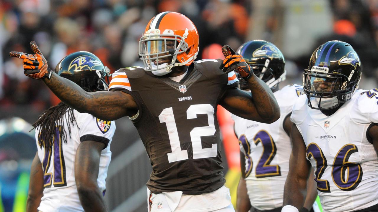
I don’t hate the Browns. I just hate their uniforms. Their only good jerseys are the Color Rush and the white away jerseys with the color rush set being the clear best uniform. They did recently change their home sets to the “neon brown” uniforms, but there’s still room for improvement.
It just feels like they were trying to do too much when they made these uniforms. The Browns wordmark on the pants looks out of place and loud, and the piping on the collar on the Brown jersey looks stupid. The oversized “CLEVELAND” above the numbers does not help either.
The classic Browns jerseys were better and the fact that they changed them from these only makes the new ones look even worse.

15. Jacksonville Jaguars
At least they fixed the helmet.

Unlike the Browns uniforms, these jerseys aren’t “bad” so much as they’re boring. I would consider the jerseys to be worse than the set from 2013-18, which is disappointing because I feel that set was ruined by the stupid looking two-tone helmet.
The pants have nothing going on. There isn’t even a stripe down the sides which I feel would bring a bit of life to the set.
These uniforms just look awkward when they go with matching jerseys and pants.
At the end of the day these aren’t bad, just boring.

14. Cincinnati Bengals
I will say, I don’t consider any of the jerseys on the rest of this list to be “bad.” The NFL has a lot of good uniforms, and the AFC teams have a strong set of uniforms. The Bengals, however, land low on the uniform food chain.
The helmets are awesome, one of my favorites, but the uniforms are becoming stale.
I feel like they could add more stripes on all of the uniforms, and for the color rush, it shouldn’t have been black and white as it clashes with the helmet.
Perhaps with the Bengals making changes on their coaching staff, the uniforms will follow suit.

13. Houston Texans
Two words: Royal blue.
The Texans uniforms would be so much better with one little change. The Texans embraced the Texas theme when they came to Houston as an expansion franchise, but they went with a navy blue instead of a lighter royal blue. The helmets are great. The logo is great. J.J. Watt is great.
Keep everything about these uniforms. Just change the navy to a royal blue. Bring the Texas flag to the football field.

12. New York Jets
The Jets would be lower if they hadn’t changed uniforms this offseason. The kelly green works so much better than the darker green from last year, and the green numbers on the white jerseys look stunning. The all green helmets were also a nice touch.
A lot of people don’t like these uniforms, and I admit the Jets’ uniforms look like the love child of the Saskatchewan Rough Riders and the North Texas Mean Green, but I think Gang Green is looking pretty sharp in these uniforms.

11. Indianapolis Colts
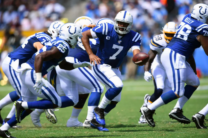
The Colts’ uniforms have remained basically the same since the Baltimore days, and it has worked for them. Blue and white is all they need to send out a goo-looking unit, so why fix what isn’t broken?
There’s not a lot to say about the Colts uniforms except that adding the blue pants for color rush nights was a nice touch. The logo remains one of the best in the NFL, and who doesn’t love seeing Andrew Luck…er, Jacoby Brissett… slinging it in the home blues?
The Colts land so low simply because other teams have better uniforms. I do enjoy the classics, but the Colts just don’t do it as well as other teams in the AFC.

10. Denver Broncos
The Broncos have a solid set of uniforms, although my least favorite is the home oranges. The color rush is nice with the throwback logo, and the alternate navy and away whites are very solid on the field. The only issue is, the throwbacks are better.
This isn’t nearly as bad as the Cleveland situation is, simply because the current Denver uniforms aren’t ugly, but I feel a Nike-modernized 80’s Broncos jersey, with a return of the lighter blue would be great for the Broncos.
Overall: Broncos are good, not great.

9. New England Patriots
As we Ravens fans (along with the rest of the NFL fanbases) have watched in horror as the Patriots keep finding ways to win Super Bowls, one thing is always certain: damn they look good in those uniforms.
Perhaps the greatest sports dynasty of all time just misses out on the top half of the AFC uniform wise, but it isn’t because they have bad sets. The silver pants with the navy jerseys with the silver helmets in the Foxborough snow is an iconic image.
I’m sorry Pats fans, but you have your six rings to comfort you, I’m sure you’ll get through this.

8. Buffalo Bills
You might have noticed a theme here. Why yes, I do enjoy red and blue together on football uniforms.
For me the game changer for the Bills was the change to the white helmet as it contrasts well with the blue jerseys, and the color rush reds are nice as well.
With the Bills trying to prove themselves as playoff contenders this season, it’s only right they look doing it.

7. Miami Dolphins
Now we’re getting to the really good ones.
The Miami Dolphins get points for not only picking a completely original look, but for also sticking with it as the years have gone on.
The Color Rush throwbacks for this season look phenomenal with the classic Fins logo back on the helmets with that particular set.
The Teal looks good in just about any setting and Fitzmagic looks kind of awesome in a Dolphins uniform.
Too bad the team isn’t very good.

6. Kansas City Chiefs
Another AFC look that hasn’t changed in decades lands high on this list.
Red and yellow is a good combo, and despite the lack of a proper color rush (though perhaps that’s a good thing because an all yellow Chiefs uniform is something I don’t want to see) the Home and away sets look good, and I’ve always liked the way the red numbers pop off the white jerseys.

5. Pittsburgh Steelers
Yeah, I don’t like praising the Steelers but I try my best to give credit when’s it’s due. The Steelers uniforms are pretty sick.
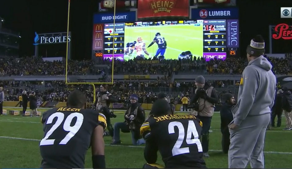
The color rushes are simple but the yellow numbers look awesome, and the black and yellow (despite how much we all hate it) is perhaps the most iconic in NFL history.
The Squeelers would probably land higher on this list for most people but as a Ravens fan, I can say, screw them.

4. Tennessee Titans
In what I consider the best NFL uniform change of the decade, the Titans claim a top five spot in the AFC.
It’s all in the small details, people. The addition of the silver shoulders were a nice touch, the navy helmets just go with the set, and the baby blue just looks better with the silver accents.
I’m a big fan of these uniforms, but they fall just short of the top 3.

3. Oakland Raiders
I have something to admit: I’m a bit of a closet Raiders fan. It is because of that bias, that I’ve always loved the silver and black look.
I have an appreciation for the classics, and the Raiders look just screams “HARD-NOSED FOOTBALL.”
The silver helmet goes with both the home and away jerseys perfectly, and the silver number on the white jersey for the color rush was a creative idea.
This look is a personal favorite of mine, but my bias towards the Raiders is topped by my love for a certain other hard-nosed football team.

2. Baltimore Ravens
Yeah, yeah, yeah I know. No one’s shocked that the Ravens are highly ranked on this list, but you know what? The Ravens just look badass no matter what set of uniforms they have on.
The purple pants were a nice addition to the Ravens uniform arsenal, as it gives the Ravens another reason to bust out the iconic black jerseys.
The numbers look good on all four jerseys, and the gold numbers on the color rush uniforms look incredible during night games.
There is only one AFC team that has better uniforms than the Baltimore Ravens. That team is….

1. Los Angeles Chargers
The Powder blues are back in the spotlight. That was the main factor in the Chargers earning the number 1 spot on this list.
Perhaps the best logo in the league (definitely top 5) only makes the uniforms on this team better. Making the gold facemasks a permanent change was also an A+ move on LA’s part.
The color rush jerseys are also my personal favorite when it comes to the color rush, and the white jerseys don’t look too shabby either.
What did you think of my list? Is there anything you would change? What’s your favorite AFC uniform? Let me know in the comments below.


